How to Create a Gantt Chart in Excel with Pictures - Step by Step
You have joined a new company and you are asked to create a Gantt Chart and you are wondering what it is? The person sitting next you might give you an already prepared Gantt Chart by don’t you it is time for you to prepare your own Gantt Chart? So let’s have a look as how to create or prepare a Gantt Chart in Excel from scratch. FYI no smart sheets. Pure excel. I also have added screenshots for easy understanding. This is also a guide to create a Gantt Chart manually in Microsoft Excel.
Include a list of tasks, start date, duration and finish date.
Example:
S.No
|
Task Description
|
Start Date
|
Finish Date
|
Duration
|
1
|
Home_Content
|
15-May
|
16-May
|
5
|
2
|
About US_Landing Page
|
15-May
|
16-May
|
2
|
Insert, and then click on the Bar chart icon. When the drop-down menu appears, choose the flat Stacked Bar Chart and this will insert a blank chart.
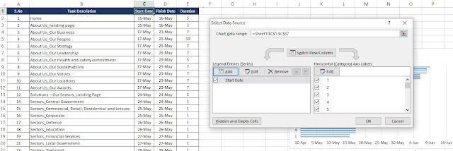
Right click on the empty chart and click Select Data and you will be prompted for data source.
Under Legend Entries (Series), click Add. This will take you to the Edit Series window.
Select Start Data in Series Name and Series Values (All Data).
In the same way, Add one more entry in Legend Entries but this time select the duration in Series Name and the values in Series Values.
The final output will be like below.
Change the dates on the left side of the chart into a list of tasks.
- Click on any bar in the chart, then right click, then open Select Data.
- Under Horizontal (Category) Axis Labels, click on edit
Using your mouse, highlight the names of your tasks. Be careful not to include the name of the column itself, Task. Below is the output.
Format Your Gantt Chart
- What you have is a stacked bar chart. The starting dates are blue and the durations are orange.
- Notice your tasks are in reverse order. To fix this, click on the list of tasks to select them, then right click over the list and choose Format Axis. Select the checkbox Categories in reverse order and Close.
Tick the Categories in reverse order and you can notice all would be reversed like shown below.

To give your Gantt chart more space delete the Start Date, Duration legend on the right. Select it with your mouse, then hit Hide the blue portions of each bar. Clicking on the blue part of any bar will select all of them. Then, right click and choose Format Data Series.
- Click on Fill then select No fill.
- Click on Border Colour then select No line
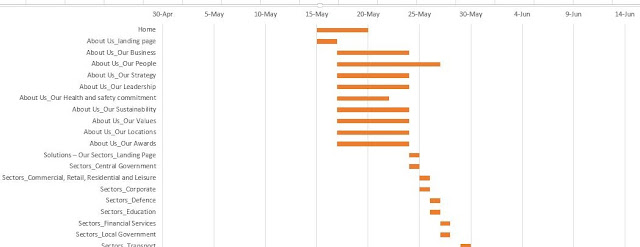
So the final output would look like this.
You just need to remove the empty white space at the start of your Gantt chart:
Click on the first Start Date in your data table. Right click over it, select Format Cells, then General. Write down the number you see. In my case it is 42870 and close the dialog box.
In the Gantt chart, select the dates above the bars, right click and choose Format Axis.
Change the Minimum bound to the number you recorded.
Change the Major unit to 2, for every other day. You can play with this to see what works best for you.
Select Close.You are all done.
In the next post, I will be sharing how to display extra days taken, negative remarks in project management with step by step and with pictures.


Post a Comment